Your conversion rates are the driving force behind your online business. Understanding conversion rate optimisation is the first step to getting more bang for your buck when it comes to online sales.
Button hierarchy – Primary, Secondary, Tertiary
This might sound complex but it’s really quite simple. Button hierarchy refers to the Call to Action (CTA) buttons you have on product pages. These are broken down into three types;
Primary – your main CTA. The thing you want customers or visitors to do when they land on this page. It might be a Buy Now button, or an Enquire for a Quote button, but it’s always the main goal of your page.
Secondary – This is included if you want to give visitors a second option, but one that isn’t as important as the Primary. For example, you may have a Buy Now button, and then further down the page is a Download Info Pack button that gives the visitor more information about the product they are buying.
You want them to pick the Primary button, but if they are hesitant, the Secondary button might give them that extra info they need to then go back and click that Primary CTA.
Tertiary – This is something additional to offer the customer if you really need to, such as a Learn More link to policy information, but should only be included if necessary.
The most important thing to remember when it comes to displaying your Primary, Secondary and Tertiary buttons is that you should never make them look the same. There’s a reason they have a hierarchy!
Look at the example below;
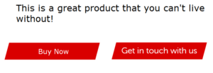
Even though your Primary CTA is first, there is no difference between the Buy Now and the Get in touch with us buttons, so how is your visitor supposed to know which one is the main CTA.
This is a better example;
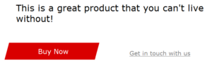
The secondary button has had the background colour removed, the text size reduced, and the text colour changed – all to reduce its impact and draw more focus to the main CTA.
Remove distractions
To increase conversion rates, think of each page as a room. Your customer enters through one door and needs to make their way across the room to the next door – which likely leads to your checkout.
You want them to make their way across the room as quickly as possible, while still giving them everything they need to get through the other on the other side.
What you don’t want is lots of obstacles in their way, distracting them or stopping them from reaching their destination. The same logic applies to your online shop if you want to increase conversion rates.
You want your pages to offer customers exactly what they need and nothing more. If they have landed on a product page and you want them to proceed to the Buy Now button, you want to remove any distractions that might draw their attention. Using the button hierarchy above is the first step, but next, you need to think about the other elements on the page.
Keep the important stuff above the fold of the page; product name, description, price, image, and delivery info. Give each element a priority and add them according to that. Less important elements, such as reviews, additional product specs, finance options, etc… can be added further down.
This way, they are still accessible should the customer want them, but they don’t distract from the important information and, more essentially, from the Buy Now button.
Add testimonials, logos, and reviews
As mentioned above, reviews, testimonials, and logos might not be considered your top tier elements for the page, but that doesn’t mean they aren’t important at all.
These sections are vital if you want to add authority and trust to your website. They don’t need to be right at the top of the page, but they do need to be included somewhere.
Reviews and testimonials are virtual word-of-mouth recommendations – supporting not only the quality of the product or services you are offering but also putting trust in your brand as a whole. You don’t need to list them all on the page either – link up to something like Trustpilot or Feefo to get reviews automatically pulled in to the relevant page.
Logos perform a similar function – highlighting the industry connections you have and lending authority to your brand. Logos can be displayed pretty much anywhere and many websites include them in their footer so they can be seen on every page.
Remove unnecessary form fields
The main difference between buying online and in shops is the information required for the former. With a shop, you walk in, pick a product, hand over money, and leave.
With online shopping or services, you often have to give more information in order to complete your purchase, such as name, address, payment information, etc…
Most of this information is necessary, but you should never add in more than you need to. It can be tempting to use form fields as a sort of data collection to get more information about your customer base. However, add too many fields into the process and you risk frustrating the customer and driving them away.
When building forms, think about what is essential for the task at hand. Checkouts should include name, address, payment details, delivery information, and potentially, a contact phone number – these are expected and will help increase conversion rates.
Simplify the navigation – use mega menus
The key to good conversion rates is to make it as easy as possible for your customers to get from Point A to Point B. For many, this is getting them from the Homepage to the checkout, and you want to make it as simple as possible to do so.
Streamlining your menu structure is a great way to achieve increase conversion rates. A mega menu will allow you to add in more categories and sub-categories in a visually appealing way, meaning your customers get to go straight to the area they want, without having to navigate through several other pages first.
A mega menu also shows the customer an overview of your site structure, so even if they aren’t sure where to find the item they are looking for, your menu structure can guide them.
For example, they have come to your site looking for a hammer. The mega menu opens to display the main category of Tools, and below that, the sub-categories of Pliers, Saws, Hammers, Drills, is displayed. Customers can see straight away where they need to go.
Conversion rate optimisation
Making some key changes to your page layout can have a massive impact on your conversion rates. But knowing what to change is vital. If you would like guidance on how to increase conversion rates on your own website, contact our expert marketing team today.