Seven seconds is all it takes to make a first impression so it’s easy to see the importance of branding and why it matters for your online business.
If a logo is too complex or looks tired and dated, people are less likely to invest their time in your business just from that one impression, but that’s not to say you need new branding, often an update could suffice.
Some of the world’s biggest brands have the most simple branding. A tick, an apple, four overlapping circles, even a registered trademark purple colour; and I bet most of these you know just from the description alone.
More and more companies are streamlining their branding as people become busier and have less time to pay attention. Less really is more because we need to be able to look at a brand in a split second and know who they are.
Logo downscaling
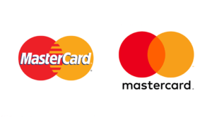
Mastercard
Mastercard uses a cleaner font, with no overly complex lines, and eventually wants to be able to remove “Mastercard” from their brand leaving only the two circles.
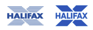
Halifax
Halifax has removed all the lines so it’s less daunting on the eyes, but also more versatile to use as a brand. The new style has the ability to have secondary brand colours and add transparency on single colours over images to add depth.
A lighter weighted and taller font also ensures the text is easier to read. The “X” has also had it’s bottom legs flipped to create a more simple shape, which draws your eyes to the centre rather than across.
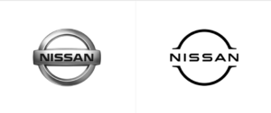
Nissan
Nissan removed their band completely but held onto its outline to reinforce the iconic look. A new simpler streamline font with increased kerning (a fancy word for spacing!) makes the branding feel fresh, modern, and stylish. An updated look whilst holding onto its aesthetics, also makes the brand more transferable, instead of looking just like a car badge.
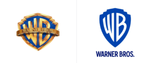
Warner Brothers
Warner Brothers completely stripped back their logo to create a new, dramatic look that is easily editable to fit within any genre of film. The flat design of this logo keeps the original WP look whilst removing the complexity of the gold outline. The increased height takes up more of a viewing area drawing attention to the brand. A new custom made typeface ties everything together and reinforces the brand even when used on its own.
Some brands do not want to lose what makes them iconic, the signature of John Cadbury is the foundation of Cadbury’s branding, but even this has had an update, bringing it in line with modern styling.
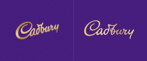
Recreating the signature to be perfectly straight, thinner, and more spaced apart instantly feels updated, cleaner, and easier to take in whilst not losing the classic feel and nostalgia of the brand. This simpler signature also makes other assets much easier to use with it, allowing them to be bolder and more eye-catching as seen in Cadburys new packaging:
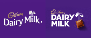
The bolder font is easier to see and read from a distance whilst keeping the flicks at the end of letters in a nod to the original. The simple milk pouring makes it much easier to see and pouring directly into the chocolate is much easier to relate to. The original packaging suited the flowing raised text as the branding pointed in that direction, but a level logo instantly makes everything cleaner and easier to lay flat.
Simple doesn’t need to be boring though and newly designed icons can have a visual eye-catching representation of what the brand is.
Understanding the importance of branding
In a nutshell:
- Keep logos clean, remove any “fuss” and items that aren’t adding anything to the brand
- A nice, easier to read font can make a huge difference in how people see your brand
- A simple soft colour range can make a brand a million times easier to see – There shouldn’t really need to be any more than three colours
- Keep a brand “flat” this way it can be used across all areas of your business from over images to the corner of a business card
- Create a strong ID “EG the Nike Tick” which can be used on its own and allow people to become familiar with that ID being your brand
Our designers can help you create the right branding for your business, so get in touch today for expert advice.