Earlier on this year, Google began to roll out a new “Home View” across all Google Analytics accounts. We’ve been using it for the past couple of months now, but how are we finding it?
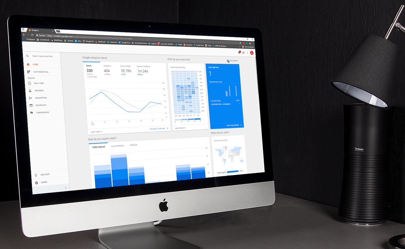
Essentially the new “Home View” is a mega report of all the stats you need to know. It’s a dashboard that picks out key metrics and displays the results in a really tidy format. The main bonus is that you don’t have to set anything up.
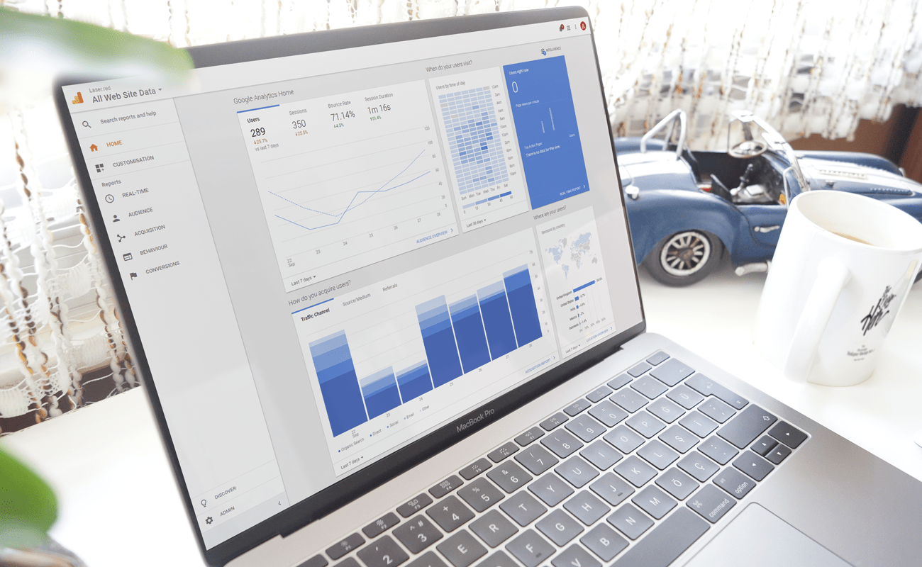
Your “Home View” will be displaying all sorts of important data – if you have goals or e-commerce data it will also pull these in. They’ve simply given you the data you need, at your fingertips.
By default you’ll see the following sets of data:
- Google Analytics Home – A breakdown of your users, sessions, bounce rate, and session duration over a period of your choosing.
- When do your users visit? – This is a heatmap display of the amount of users you’re receiving, broken down into day and hour slots.
- Users right now – A real-time view of the users on the website at that precise moment, with the top active pages.
- How do you acquire users? – This is an overview of all your visitors and where they came from, organised by a timeframe of your choosing.
- Where are your visitors? – This is as simple as you think, a map of where your active session have originated from around the world.
- What pages do your users visit? – Your most popular pages on your website. Don’t worry if your top page is “/”, this just means your homepage.
- How are your active users trending over time? – Active users are the number of unique users who had at least one session within a certain date range, usually 1-day, 7-day and 30-day.
- What are you top devices? – This shows a beautiful graph of the most popular devices used to view your website.
- How well do you retain users? – This data is pulled from your Cohort Analysis, which is the analysis of a group of people who interacted with your website at the same time. It’s a very confusing metric which we rarely use.
- How are you performing against goals? – This data is all your goal and conversion information, so you can see very clearly how many goals the visitors completed, as well as which goals specifically.
You’ll also potentially see other modules on your new homepage. For example, ours currently gives us a breakdown of how our AdWords campaigns are performing, as well as our remarketing campaigns.
All of the above reports are self-explanatory, but if you want to look further into it you can go directly to where the data is pulled in from within Analytics. All you need to do is click the arrow text at the bottom of each module to go to where the data is pulled from.
We absolutely love how visual this entire Home View is. It has definitely taken inspiration from the brand new AdWords interface that is being tested at the moment. It’s very useful and very easy to understand.
They’ve done a really good job at making it just that tiny bit easier and quicker to pull out some important stats.
I hope you find the new Home dashboard as useful as we do, and it helps you use Google Analytics to the best of its abilities. If you want me to explain anything in more detail give me a call on 01472 878 496 or alternatively email me on [email]marketing@laser.red[/email]